
Create a responsive login form using HTML,CSS and Bootstrap
Contents
In this example, we have used HTML,CSS and Bootstrap to design the responsive login form. Bootstrap class container-fluid is used to set the content’s margins and handles the responsiveness of the form. It helps to adjust the pixel of the content that used inside the form.
The bootstrap grid system contains the row elements and the row elements are the container of columns. Here we have those elements along with the container-fluid class so that we can place the entire login form in the required location. Inside the container section, we have added the login form design in the below code.
Login form design using HTML and Bootstrap code
<html>
<head>

   <!-- Required meta tags -->
    <meta charset="utf-8">
    <meta name="viewport" content="width=device-width, initial-scale=1, shrink-to-fit=no">

  <!-- Bootstrap CSS -->
<link rel="stylesheet" href="https://stackpath.bootstrapcdn.com/bootstrap/4.1.3/css/bootstrap.min.css" integrity="sha384-MCw98/SFnGE8fJT3GXwEOngsV7Zt27NXFoaoApmYm81iuXoPkFOJwJ8ERdknLPMO" crossorigin="anonymous">
 <link rel="stylesheet" href="css/login_style.css">
</head>

<body>
  <!-- Optional JavaScript -->
    <!-- jQuery first, then Popper.js, then Bootstrap JS -->
<script src="https://code.jquery.com/jquery-3.3.1.slim.min.js" integrity="sha384-q8i/X+965DzO0rT7abK41JStQIAqVgRVzpbzo5smXKp4YfRvH+8abtTE1Pi6jizo" crossorigin="anonymous"></script>
<script src="https://cdnjs.cloudflare.com/ajax/libs/popper.js/1.14.3/umd/popper.min.js" integrity="sha384-ZMP7rVo3mIykV+2+9J3UJ46jBk0WLaUAdn689aCwoqbBJiSnjAK/l8WvCWPIPm49" crossorigin="anonymous"></script>
<script src="https://stackpath.bootstrapcdn.com/bootstrap/4.1.3/js/bootstrap.min.js" integrity="sha384-ChfqqxuZUCnJSK3+MXmPNIyE6ZbWh2IMqE241rYiqJxyMiZ6OW/JmZQ5stwEULTy" crossorigin="anonymous"></script>
<!-- Login form creation starts-->
  <section class="container-fluid">
    <!-- row and justify-content-center class is used to place the form in center -->
    <section class="row justify-content-center">
      <section class="col-12 col-sm-6 col-md-4">
        <form class="form-container">
        <div class="form-group">
          <h4 class="text-center font-weight-bold"> Login </h4>
          <label for="InputEmail1">Email Address</label>
           <input type="email" class="form-control" id="InputEmail1" aria-describeby="emailHelp" placeholder="Enter email">
        </div>
        <div class="form-group">
          <label for="InputPassword1">Password</label>
          <input type="password" class="form-control" id="InputPassword1" placeholder="Password">
        </div>
        <button type="submit" class="btn btn-primary btn-block">Submit</button>
        <div class="form-footer">
          <p> Don't have an account? <a href="#">Sign Up</a></p>

        </div>
        </form>
      </section>
    </section>
  </section>
<!-- Login form creation ends -->
</body>
</html>
Add CSS : (File name -login_style.css)
/* set entire body that is webpage */
body{
background: #383a3d;
padding-top: 25vh;
}
/* set form background colour*/
form{
background: #fff;
}
/* set padding and size of th form */
.form-container{
border-radius: 10px;
padding: 30px;
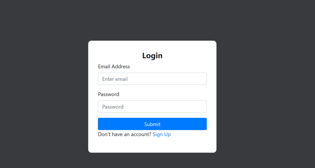
}Login form in Desktop view
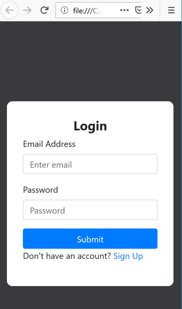
Login form in Mobile view
Recommended Articles