
How to create the responsive header for a website using Bootstrap
Contents
Bootstrap – Front end framework
Bootstrap is the popular front end web development framework for developing responsive website. It adjust the web page size based on screen/device type such as desktop, tablet or mobile .It contains the HTML, CSS and Javascript design templates that includes navbar, buttons, panels, progress bar, drop down, form, container and so on.
In this example, we are going to create the navigation bar for a Travel website. Here we are using bootstrap version 4 to build the responsive header. Along with bootstrap, we can use other HTML tags and CSS style classes for creating beautiful website.
Components used in HTML
In the header section, we have included the bootstrap libraries and custom style sheet file to access the components from it. Lets see the other bootstrap classes that used to build the navigation bar.
- navbar class – The responsive header is created using the .navbar bootstrap class. It supports for branding, navigation, colour and more with the help of other classes such as navbar-expand-lg, navbar-light, bg-info.
- nav-item & nav-link – The menu item and the corresponding link is created with the help of nav-item and nav-link classes.
- btn class – The button styling properties are fetched from btn class in bootstrap.
HTML code
<html>
<head>
<!-- Required meta tags -->
<meta charset="utf-8">
<meta name="viewport" content="width=device-width, initial-scale=1, shrink-to-fit=no">
<!-- Bootstrap CSS -->
<link rel="stylesheet" href="https://stackpath.bootstrapcdn.com/bootstrap/4.1.3/css/bootstrap.min.css" integrity="sha384-MCw98/SFnGE8fJT3GXwEOngsV7Zt27NXFoaoApmYm81iuXoPkFOJwJ8ERdknLPMO" crossorigin="anonymous">
<link rel="stylesheet" href="style.css">
</head>
<body>
<!-- Optional JavaScript -->
<!-- jQuery first, then Popper.js, then Bootstrap JS -->
<script src="https://code.jquery.com/jquery-3.3.1.slim.min.js" integrity="sha384-q8i/X+965DzO0rT7abK41JStQIAqVgRVzpbzo5smXKp4YfRvH+8abtTE1Pi6jizo" crossorigin="anonymous"></script>
<script src="https://cdnjs.cloudflare.com/ajax/libs/popper.js/1.14.3/umd/popper.min.js" integrity="sha384-ZMP7rVo3mIykV+2+9J3UJ46jBk0WLaUAdn689aCwoqbBJiSnjAK/l8WvCWPIPm49" crossorigin="anonymous"></script>
<script src="https://stackpath.bootstrapcdn.com/bootstrap/4.1.3/js/bootstrap.min.js" integrity="sha384-ChfqqxuZUCnJSK3+MXmPNIyE6ZbWh2IMqE241rYiqJxyMiZ6OW/JmZQ5stwEULTy" crossorigin="anonymous"></script>
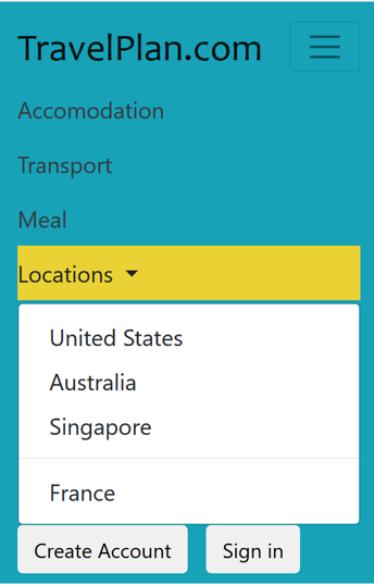
<nav class="navbar navbar-expand-lg navbar-light bg-info">
<a class="navbar-brand" href="#">TravelPlan.com</a>
<button class="navbar-toggler" type="button" data-toggle="collapse" data-target="#navbarSupportedContent" aria-controls="navbarSupportedContent" aria-expanded="false" aria-label="Toggle navigation">
<span class="navbar-toggler-icon"></span>
</button>
<div class="collapse navbar-collapse" id="navbarSupportedContent">
<ul class="navbar-nav mr-auto">
<li class="nav-item active">
<a class="nav-link text-dark" href="#">Accomodation <span class="sr-only">(current)</span></a>
</li>
<li class="nav-item">
<a class="nav-link text-dark" href="#">Transport</a>
</li>
<li class="nav-item">
<a class="nav-link text-dark" href="#">Meal</a>
</li>
<li class="nav-item dropdown">
<a class="nav-link text-dark dropdown-toggle" href="#" id="navbarDropdown" role="button" data-toggle="dropdown" aria-haspopup="true" aria-expanded="false">
Locations
</a>
<div class="dropdown-menu" aria-labelledby="navbarDropdown">
<a class="dropdown-item" href="#">United States</a>
<a class="dropdown-item" href="#">Australia</a>
<a class="dropdown-item" href="#">Singapore</a>
<div class="dropdown-divider"></div>
<a class="dropdown-item" href="#">France</a>
</div>
</li>
</ul>
<button type="button" class="btn btn-default btn-space navbar-btn navbar-right">Create Account</button>
<button type="button" class="btn btn-default btn-space navbar-btn navbar-right">Sign in</button>
</div>
</nav>
</body>
</html>CSS – File name style.css
.navbar-custom {
    color: #CC3333;
    background-color: #9132a8;
    }

 .btn-space {
    margin-right: 10px;
}
.navbar-brand{
	color: #42f5c8;
	font-size: 30px;
	font-family: "candara";

}
a:hover {
  background-color: #ebd234;
}
a{
	font-size: 18px;
}
.nav-link{
	color: #FFFFFF;
}
Recommended Articles